ASSIGNMENT TWENTY: CHOCOLATE
CREATIVE CLASS: ASSIGNMENTS TO HELP CONSTRUCT A POWERFUL PORTFOLIO
CHOCOLATE: WE WANT TO WANT IT BAD!
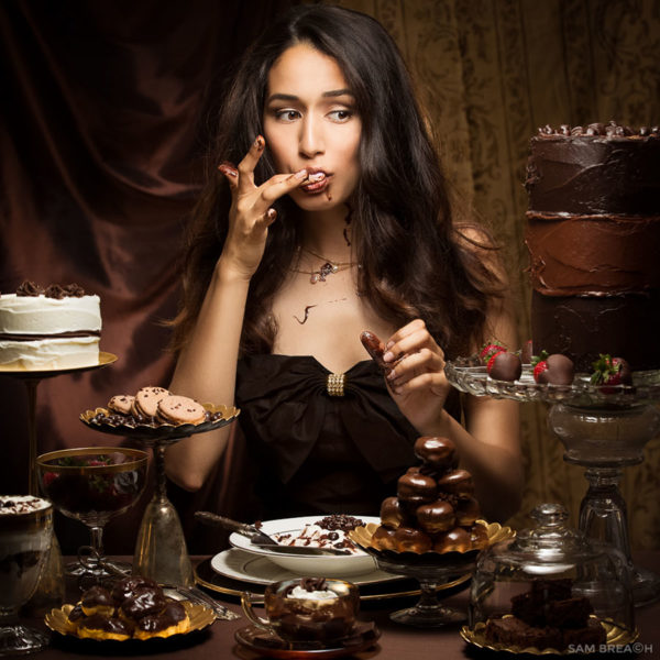
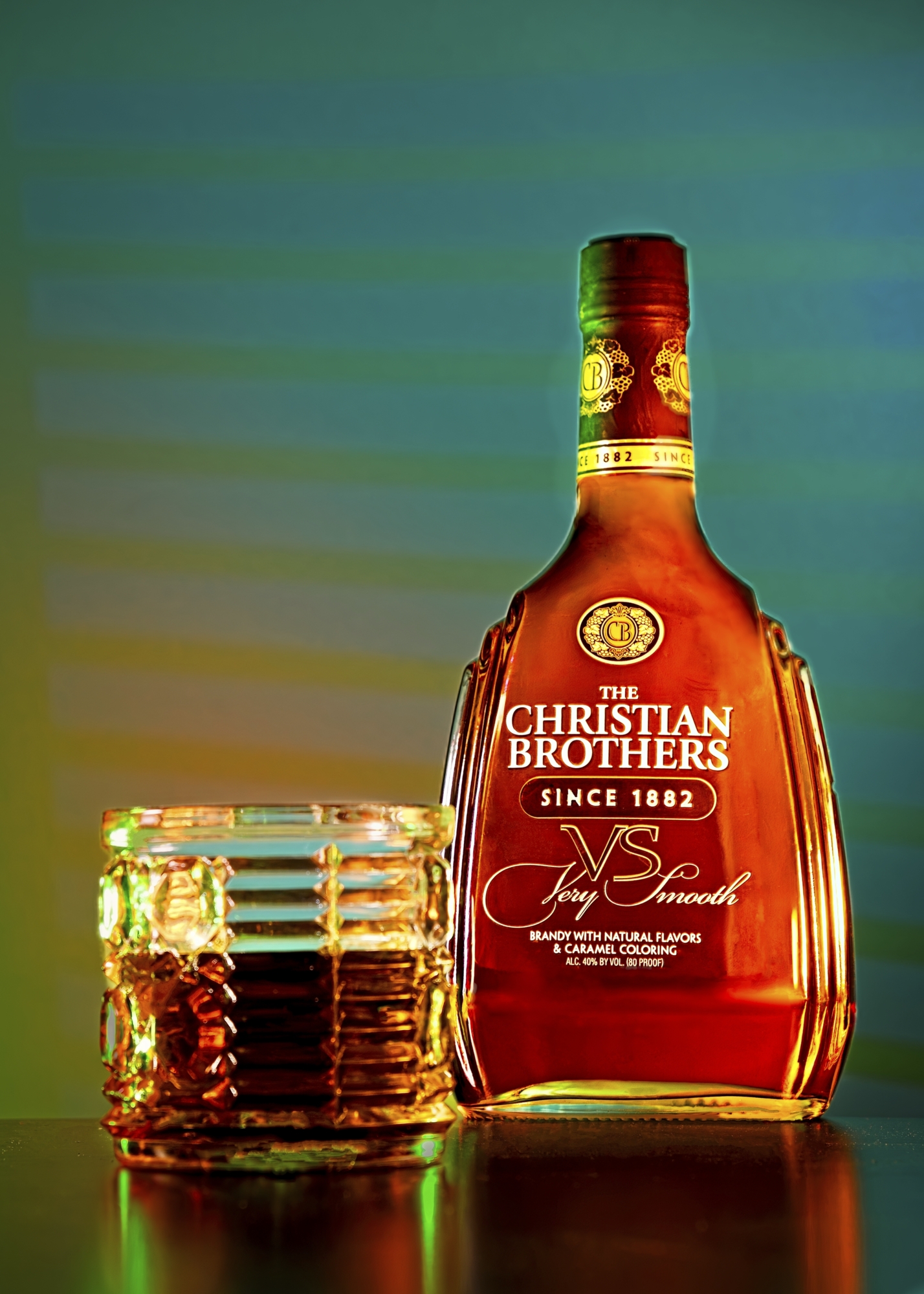
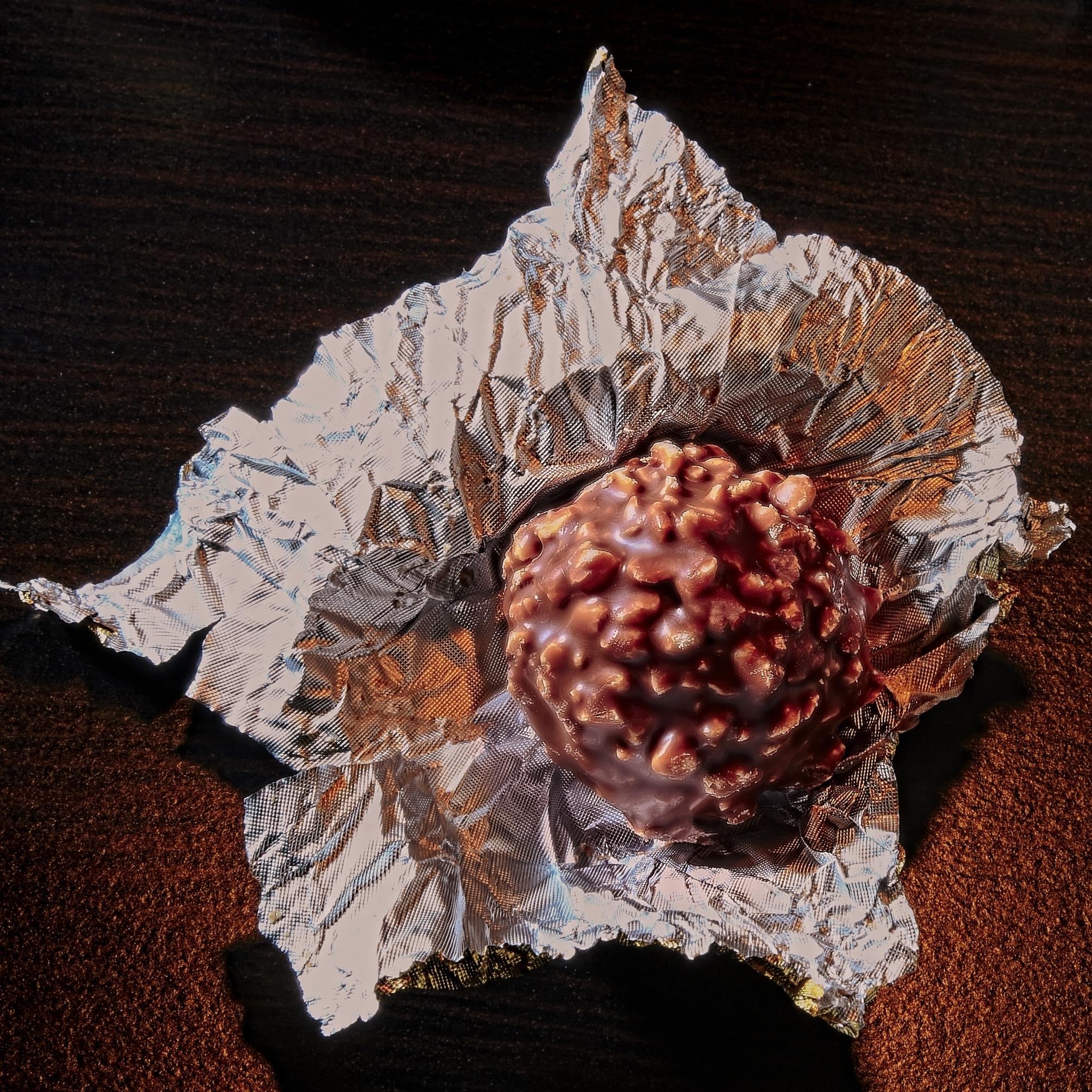
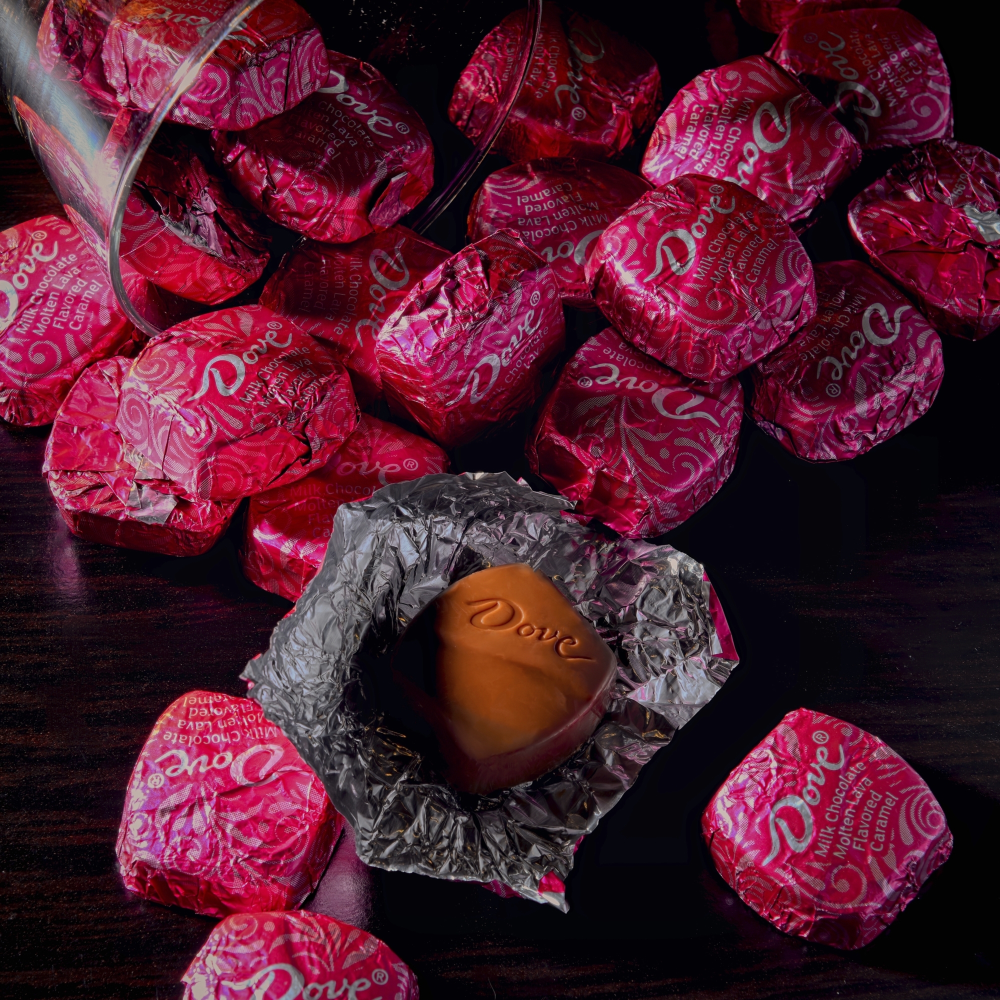
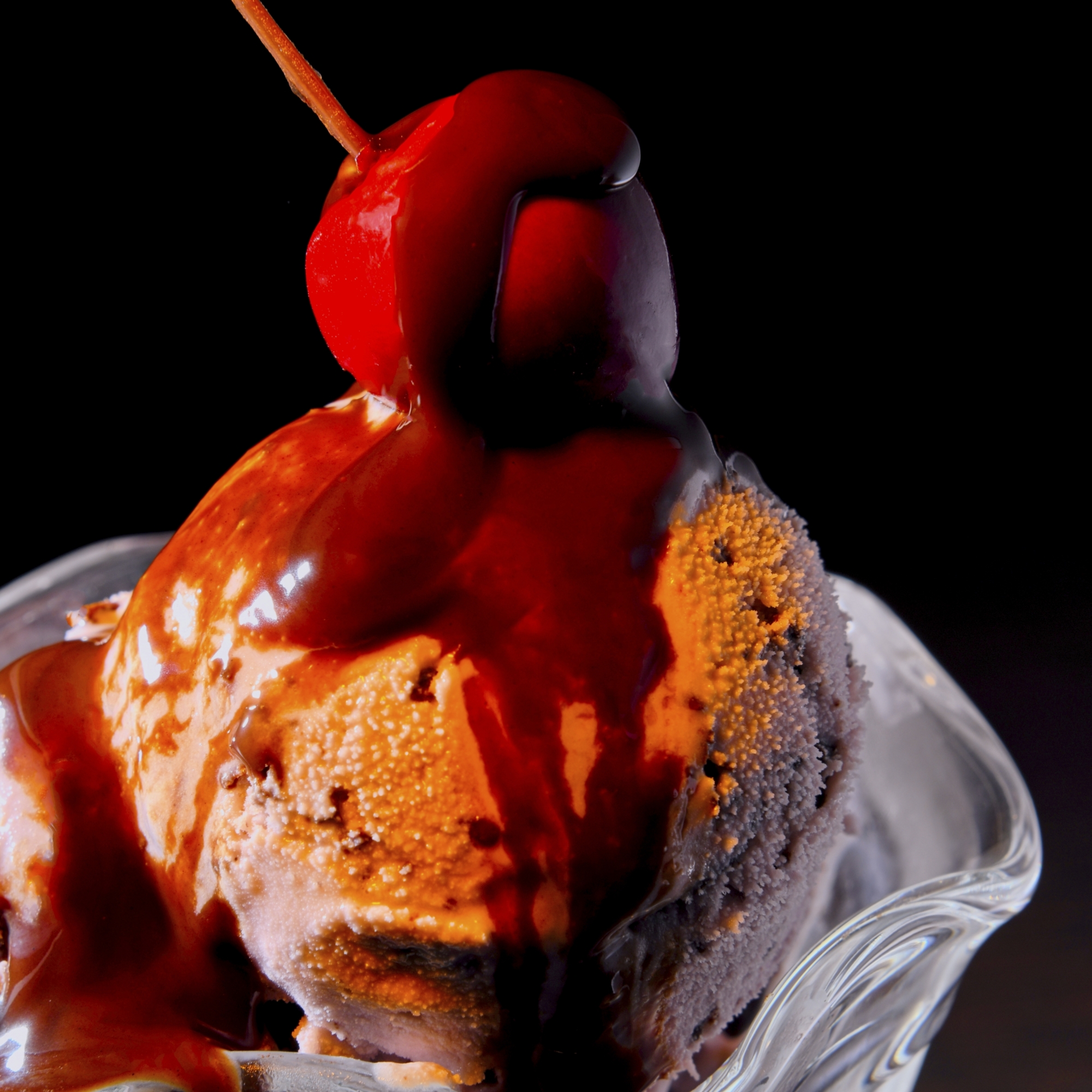
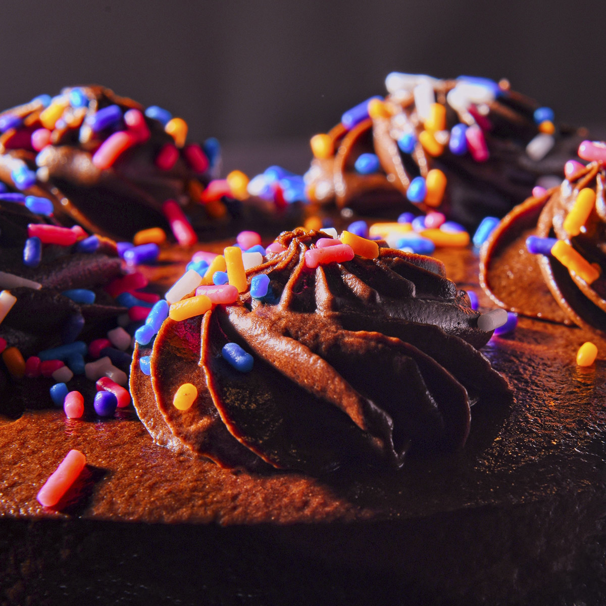
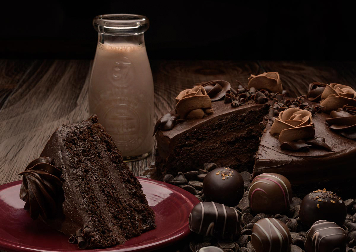
A local restaurant has decided to run a special on chocolate on their menu for the next month. They need something that says, no – SCREAMS Chocolate!!! People or still life or cute little furry animals or fish… … well… probably not fish… but you get the idea.
Chocolate Indulgence
Creative Director, Photographer, Retoucher: Sam Breach
http://www.sambreach.com
Hair and Make Up:
Hayley Fenech
http://www.hayleynoelartistry.com/
Model: Lissette Maravilla
All Rights Reserved 2015
Find out how this image was made here.
Chocolate… and they are featuring chocolate candies, pie, cake, ice cream, and specialties. Chocolate.
It’s that simple… and that hard.
Oh, and they want it to have a bit of an editorial look as well if possible. (Of course it is possible…)
Oh, one more thing – the finished art work is a square… that is predetermined by their menu, so no options there.
Final image is to be a SQUARE.
There may be type on it, but that is not an issue now… just make the shot so freekin’ chocolaty that we feel a need to brush after looking at it.
People in the shot? Sure – as long as the image fairly screams “chocolate”.
Still Life? Absolutely. Food related? Yep.
Location? If you can pull that off and have the chocolate be the star, then have at it.
If you are a people shooter, shoot people with chocolate. If you are a still life shooter, shoot still life. Kids, or landscape or environmental… whatever YOUR personal interest is, shoot that. This is where you let YOUR style and vision direct the end product.
(Note: all chocolate left over should be packaged very nicely and sent straight away to me. Please do not crush any of the delectable goodies.)
Chocolate is a fairly delicate subject. Fingers can destroy the very smooth surface. I will use tongs or small spatulas for moving the items around. Occasionally there will be a mark or scrape on the chocolate. It manifests itself as a bit brighter area to almost white. I use a very soft cloth with a tiny – TINY – amount of vegetable oil to wipe the chocolate down and create a new looking surface.
Heat is not our friend. Even modeling lights can create a disaster with the chocolate, so work with dummy or bad pieces of chocolate to work out the lighting. After it is what you want, change out the ‘stand in’ chocolate for the good stuff and shoot quickly. Remember not to move it from areas that are visible to camera.
Chocolate runs from the very dark to lighter milk chocolate. The very dark chocolate has almost a black color, with a very efficient (shiny) surface. Use specular highlight and reflections of white cards to create the shape and texture of the very dark chocolate. Milk Chocolate has a higher true value color, so there is a little more latitude for creating lighting that shows the color without the absolute necessity for specular or reflective light.
The higher the quality of the chocolate the easier it is to work with. Look for hard shell or more “boutique’ types of chocolate items to shoot. You may have more luck with the chocolate not getting marks or skids on it.Be very picky when you are shopping for the chocolate. Do not let the clerks bag them together if they are loose items. Take your own baggies and tray… buy the chocolate and then carefully insert it into the baggie and set it on the tray. Sound like a lot of effort? It is… that is why we get the big bucks to do this stuff.Some items like fudge, or chocolate brownies, will have a natural texture to the cut side. Cuts will slowly (quickly on shoot days) turn dry and unattractive.
Use a VERY sharp knife to cut them on the edge (1/8 inch) to reveal the new, rich looking chocolate. And wiping them with a very slight amount of cooking oil may also bring a little freshness back to them.
Lighting should run from natural and diffused natural (window, north light window or non-direct sun) to softboxes and scrims for strobes. Remember that your light source may actually be SEEN in the chocolate if it is a shiny surface, so creating a look of smooth light and soft specular is very important.
Shots from our previous students to make your mouth water a bit.
Here’s a very interesting resource. I am not responsible for any late night runs to the supermarket in search of chocolate after linking this page… you are on your own.
A nice blog of chocolate photographs.
I was asked to define the an “editorial” approach means. When shooting something like this we can take many paths – one is catalog. Those images are designed to show the product as it is. “This is what the cherry chocolate truffle looks like”. And while photos of chocolate are never totally boring – heh – they are workaday shots. And they can also be quite important for you to understand. Here are some Non-Editorial shots:
An “editorial” approach is more of the introduction of a “story” or emotion into the images. Less “perfectly shown” to more of an exploration of what the chocolate means to the viewer. These shots blend people into them as well – so don’t think it has to be a still life.
And no, some of these would not satisfy this particular client since some do not show the chocolaty chocolate of chocolate they want to see… but they are ‘editorial’ in style.
Make us all go “Yum” and you are in good territory.
ASSIGNMENT:
A brochure for a candy company.
Full layout, four pages.
Chocolate Fancee is the chocolatier.
1. Design a logo with AI.
Leonardo, Firefly, Canva
Generate text with Chat GPT, or try this one: it’s free.
Size and layout: either horizontal (landscape) or square.
Find font pairings with AI as well, or research font pairings online.
Be prepared to discuss why you chose the font pairings.
NOTE: the display font for the logo is not one of the font pairings.
Review Information
Image Upload Form
|
Upload files
|
|
|
|
|
|
|
|
|
JPEG, GIF, PDF only,
Image size: 1400 pixels on the longest side max.
Naming Convention: firstname-lastname-date
ZOOM MEETINGS: 10 AM PACIFIC
SOFTWARE:
Photoshop
GIMP
Affinity Photo
Pixelmator
InDesign
Affinity Publisher
Scribus
Adobe Illustrator
Affinity Designer
Premiere
Premiere Express
Canva
Adobe Express
CapCut
Adobe Firefly
Chat GPT
AudioPen
Hypefury
Typeshare
Figma
Milanote
----
Our Facebook Page for sharing work and meeting peers. All are welcome.
CHAT GPT
I recommend the paid version because I believe GPT 4 is far better generation.
But at least get the free one.
TOOLS TO HELP YOU SUCCEED
Canva and Express both have wonderful presentation tools built in. But if you want something a bit different, here are some stand-alone tools that could be just the thing for you.
AI DESIGN TOOLS
PRESENTATIONS
TOME
Speak your mind. Whatever you want to say, Tome helps you figure out how to say it, without losing the nuance or struggling for hours with design and formatting. Free version available.
Magicslides.app
Say bye-bye to boring, laborious presentations making. Let the computer do the hard work and make the presentations for you! For Google Slides. Free version available.
SlidesAI.io
Very cool and very inutitive way to put together a deck or presentation. Free version available.
SlidesGPT
This is a very interesting and easy to use tool. Free version available.
AI LOGO TOOLS
WIX Logo Maker
One of the earliest on the market.$99 makes it very affordable.
DesignEvo
DesignEvo is a free online logo maker with 10,000+ templates that anyone can use to bring to life a compelling, unique logo in minutes. Free version avaiable.
Looka
A very good logo maker. And it can give you a full brand kit along with it.
Check it out.
AI SOCIAL MEDIA DESIGN TOOLS
Predis.ai
Predis will help you create social media posts from existing content. Pretty slick and a time-saving tool for sure.
Parade
This software will help you design a brand strategy from scratch.
Ballonary
Build social media ads with fast and efficient tools. Starts at $9 per month

