FREE MODULE FOUR: INTRODUCING GRAPHIC DESIGN
WORKING WITH SHAPES, COLOR, AND TYPOGRAPHY
MODULE FOUR: ADDING GRAPHIC DESIGN
The Role and Impact of Design in Business Communications:
More Than Just A Picture
You are now artisans of emotion and craftsmen of imagery
You’ve crafted mesmerizing shots, and told enchanting tales, but have you ever wondered why some of them skyrocket while others, equally magnificent, fade into obscurity?
Often, it’s not the image itself, but how it’s told.
Enter: Design.
Seth Godin once remarked, “In a crowded marketplace, fitting in is failing. Not standing out is the same as being invisible.”
So, how do we ensure we’re seen, heard, felt?
This module unravels that very secret.
1. The Science Behind the Art: Design isn’t just about aesthetics. It’s psychology, sociology, and a dash of alchemy all combined. Learn the why behind the what. Why does a certain color evoke trust? Why does a particular layout keep eyes glued?
2. The Visual Vocabulary: Every shade, every shape, every space speaks. Decode the language of design and harness it. Understand how visual elements can complement your words and photographs to create an even stronger narrative.
3. The Business of Attention: In this age, attention is currency. Dive into the principles that ensure your communications aren’t just seen but remembered. Make your audience pause, think, and act.
4. Design-Driven Storytelling: Discover how design can be your silent storyteller. Sometimes, what’s unsaid, what’s merely hinted at through design, can shout louder than any word or image.
5. Digital Vs. Print: The Dual Dimensions: The medium matters. Unveil the nuances of designing for the digital realm and the tactile world of print. How do they differ, and where do they converge?
6. Adaptability is Key: In the dynamic world of business, flexibility reigns supreme. Master the art of creating designs that are both timeless and timely.
7. Collaboration: Uniting Words, Images, and Design: Unravel the magic that occurs when photography, writing, and design dance in harmony. It’s not about competing; it’s about complementing.
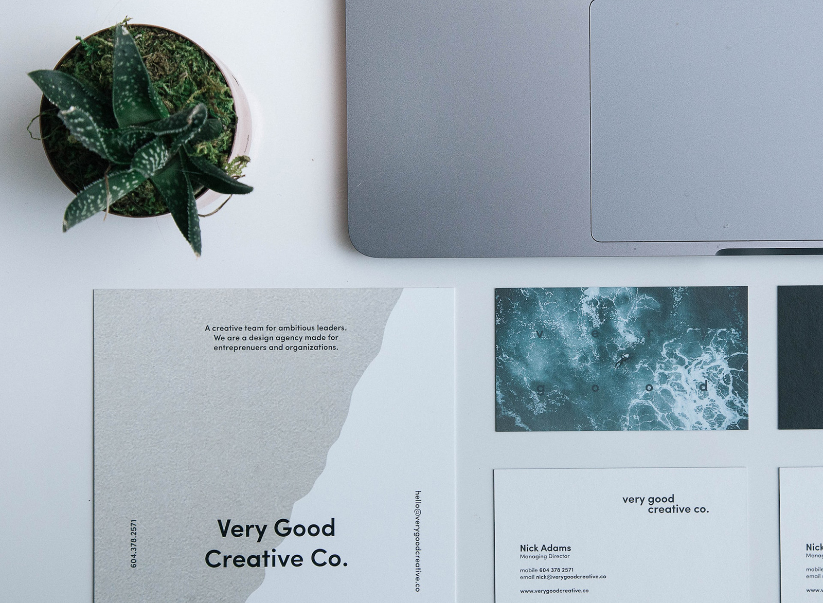
This module is to get you thinking about adding design to your toolkit. You can see that it is not as hard as you think it may be, and there are workarounds to help you master the craft.
Three fast ways to learn about design; hands-on:
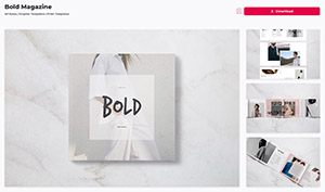
1. Use Creative Market or Envato Elements to download a design you like. Before you purchase (note: both give away freebies when you sign up, no purchase necessary), make sure you have the software to work with the files. They will be noted as working with InDesign, or Illustrator, or Photoshop. Only get the one that you can open.
The file generally comes with the fonts as well, so you will be able to study the font pairings and how they are used. Occasionally you pick up a nice display font as well.
Tear it apart.
Look at the spacing, the way the type works with the elements on the page, and how the designer used contrast in color or shape. We aren’t learning software here, although many of you will, we are learning the design and how the pages layout.
2. Grab a tear sheet from a magazine or brochure you really like.
Grab a ruler and a notepad. What do you see? Where did the designer put the logo or brand name? What did they do to move the eye and grab attention? What colors did they use? How did they handle contrast, hierarchy, dimension, scale, and viewer engagement?
3. Take a good Graphic Design course online.
A basic course will be all that you really need if you do the above and have some idea of what looks good.
Or:
Take your own photographs and layout a magazine. If you cannot take the time to write text, use an Ipsum Lorem tool to provide you with lots of unreadable gobbledygook so you can see texture.
Lay out a small brochure as well. A big flyer. Use your work to bring it alive.
OPTION TWO:
Layout a magazine story on something you have not shot yet. All you will have is an idea of a lead shot (opening page of the article) and a few slots for secondary photos. You then go and shoot to this predetermined layout. Did you get images that you could crop into strange image configurations if needed?
BONUS: Use the template you got from CM or Envato and put your own photography into it. Just make it new photography, not something you have lying around.
Below is an example of a flyer in Photoshop.
This is the template I downloaded.
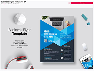
This is a good design from Envato. You can not only play with the design, you can learn InDesign as well.
FREE MODULE FOUR
SOFTWARE:
Photoshop
GIMP
Affinity Photo
Pixelmator
InDesign
Affinity Publisher
Scribus
Adobe Illustrator
Affinity Designer
Premiere
Premiere Express
Canva
Adobe Express
CapCut
Adobe Firefly
Chat GPT
AudioPen
Hypefury
Typeshare
Figma
Milanote
----
Our Facebook Page for sharing work and meeting peers. All are welcome.
RESOURCES
WHERE TO GET TYPE AND FONTS
Here are some websites that offer free fonts:
-
One of the oldest and best sources for downloading fonts, Dafont has over 77,000 fonts.
— -
This site is a great resource for fonts that are free for commercial use.
… -
This site offers a lot of free fonts that are open source and can be used for personal or commercial use.
… -
This site has over 16,000 fonts that can be used for commercial use.
… -
This site has a large collection of free fonts, many of which are free for commercial use.
The Essential 8: Fonts Every Designer Should Know and Utilize
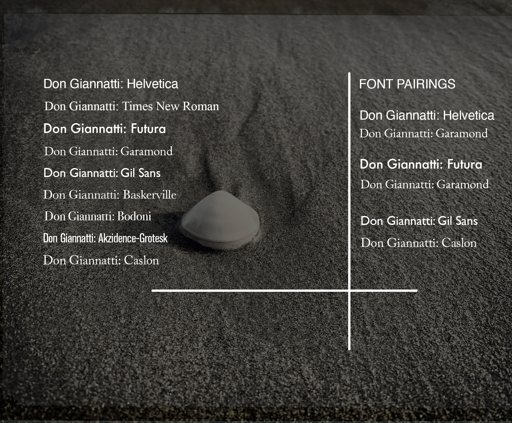
Typography forms the foundation of design, and choosing the right font can make or break a project. While there are thousands of fonts available, a few have withstood the test of time and have become staples in the design community. Here are the essential eight fonts that every designer should be familiar with:
- Helvetica: This Swiss-designed sans-serif is the epitome of neutrality and clarity. From corporate logos to subway signs, its versatility has made it a favorite since its introduction in 1957. There’s a reason why it’s often joked that designers use Helvetica for everything—it just works.
- Times New Roman: Rooted in tradition, Times New Roman is a serif font often associated with newspapers, books, and academic papers. Its familiarity and readability make it a reliable choice for extensive textual content.
- Futura: With its geometric shapes and modernist charm, Futura captures the essence of forward-thinking and modern design. From logos to headlines, it’s a font that always feels fresh.
- Garamond: Named after the 16th-century French punch-cutter Claude Garamond, this elegant serif font is often chosen for its timeless beauty and readability. It’s a favorite for books and other long-form content.
- Gill Sans: A humanist sans-serif, Gill Sans merges the clarity of sans-serif designs with some classical structural characteristics typical of serif typefaces. Its balance between modernity and tradition has made it a mainstay in the design world.
- Baskerville: A transitional serif typeface, Baskerville stands out with its refined structure and high contrast. Its unique design ensures that it remains both legible and elegant—a combination that has been appreciated in both print and digital formats.
- Bodoni: With its dramatic contrast between thick and thin strokes, Bodoni is a modern serif typeface that brings a touch of sophistication and luxury. It’s a popular choice for fashion magazines and upscale branding.
- Akzidenz-Grotesk: Predating Helvetica, Akzidenz-Grotesk is a sans-serif typeface that has influenced a multitude of modern fonts. It boasts a straightforward, objective design, making it a favorite for both print and digital mediums.
- Caslon: Stepping back into the 18th century, we find Caslon, a serif typeface named after its creator, William Caslon. A typographic gem of its time, Caslon boasts an organic, warm feel, making texts appear approachable and readable
Stick with these. They are beautiful, bold, and can handle 90% of your typographic needs.
NOTE: There will be times when you can use Display Fonts for character and color.
Share your assignments on our free Facebook Group for feedback from peers, artists, and me. It is a great group of people.
NOTE: These are long videos designed to teach you fast. Watch them at least twice and have your computer and design open when you do.
My other places on the web.
My Substack. Lots of free content and special goodies all through the years.
The Premium folks get more, of course.
Lighting Essentials - a place for photographers.
Workshops, tutorials, and more.
My Personal Site: Mentoring, journal of work, and lots more.
Business of photography and open cohorts for those interested.
My Medium Pages: Writing, writing, and more, you guessed it, writing.
I write about photography,mototcycles, travel, and the occasional rant about AI.
Don Giannatti Photography
My pictures.

Join us in The Creative Class, a transformative journey into the world of creativity. In just a few sessions, we’ll challenge your perspective, sharpen your skills, and ignite that inner spark you’ve always felt.
It’s a vibrant community, an experience, a place where ideas dance, and visions come to life. Twenty six modules that will be constantly updated, a current blog, and crazy amounts of resources, ideas, and the best of the creative community.
What are Display Fonts?
Display fonts, as the name suggests, are specifically designed for use at large sizes, ensuring they grab the viewer’s attention. They are often the “loudspeakers” of the typography world: bold, expressive, and full of character. While traditional fonts aim for legibility and neutrality, display fonts venture into the realms of creativity and uniqueness.
Key Features of Display Fonts:
- Distinctiveness: Display fonts often have unique characteristics that make them stand out, be it intricate details, unconventional shapes, or whimsical elements.
- Limited Text: Given their decorative nature, display fonts are best suited for short bursts of text like headlines, logos, or posters. They aren’t designed for extended paragraphs or body text.
- Mood Setters: Their distinct styles can instantly set the tone for your design—be it vintage, futuristic, playful, or dramatic.
ASSIGNMENTS:
- Create a set of ads for a magazine. One full page, and one half page. Use good design and excellent typography.
- Create a drop-off piece for your business: 5.5×8.5 or 6×9 postcard. One photo on the front, two on the back. Add contact information in a hierarchical manner.
- Design a poster 11×17. One photograph, and clean text. Three orders of heirarchy.
