VISUAL BRANDING
CREATIVE CLASS FIFTEEN

VISUAL BRANDING

OUTLINE OF THE ABOVE VIDEO
Mastering Branding in 2023: A Detailed Look into Building a Strategic Brand
Branding has always been a powerful tool, but in our modern, hyper-connected world, it’s become an art and science of its own. Want to have a shot at winning the attention and loyalty of consumers in this competitive age? Let’s deep dive into some essential branding insights from Merlin’s comprehensive guide on the topic.
The Core of Branding: More Than Meets the Eye
Dive into the video at 00:00. Branding is all about positioning your business as the more appealing choice for a specific group. But, remember, this isn’t just about a pretty logo or a sleek website. It’s about constructing an entire brand ecosystem. Get this right, and you’re on your way to influencing those crucial buying decisions.
The Strategy Behind the Magic
At 03:35, the conversation shifts to the heartbeat of branding: strategy. Your brand might have the charm to attract consumers, but without a solid strategy, influencing their buying choices is going to be an uphill battle. Remember, it’s your unique position in the market, your messaging, your story – these elements guide the audience from mere observers to loyal customers.
Know The Audience
Fast forward to 06:52, where the emphasis is on segmenting and honing in on your target market. This can’t be stressed enough: if you’re talking to everyone, you’re speaking to no one. Identify gaps, be different, provide unique experiences, and be specific in whom you’re talking to. Capture their attention with visuals, but win their hearts with a distinct brand personality.
Voice Matters: Crafting Brand Personality and Verbal Identity
By 10:11, the discussion shifts to the magic of words. Think of this as your brand’s voice – the way you sound and the words you choose can captivate your audience, making them feel like you’re speaking directly to them.
The Art of Storytelling
Head to 13:24 to uncover the art of brand storytelling. Here’s the deal: if your brand was a book, would it be a page-turner? By crafting a gripping narrative, you can align your brand with your audience’s journey, making them feel connected and invested in your story.
Name Game and Taglines
Then, at 16:29, the video dives into the importance of a brand name and tagline. These aren’t just labels; they’re your brand’s introduction and hook. Once these elements are nailed down, visuals come into play.
A Picture Speaks a Thousand Words
By the time you reach 19:09, you’ll understand the power of visual identity. But, here’s the twist: it must be crafted with your brand strategy at the forefront. It’s about weaving in brand personality and verbal elements into your visuals seamlessly.
Sealing the Deal with Strategy
Finally, at 22:00, the core takeaway is about harmonizing your brand and marketing strategy. Understand, engage, and influence your audience’s perception. Identify where they are and reach them effectively.
To sum it up, building a brand in 2023 requires a meticulous blend of strategy, understanding, and effective communication. Dive into the details, as Merlin masterfully guides you through, and sets your brand up for undeniable success.
Visual Branding in Modern Times: A Guide to Getting It Right
Welcome to visual branding. Now, more than ever, the way a brand looks plays an instrumental role in how it’s perceived and recognized.
Let’s look at what you should be focusing on in these modern times.
1. It’s More Than a Logo
First and foremost, let’s get one thing straight: your brand is not your logo. While a logo is an integral component, visual branding extends far beyond that. It encompasses the entirety of a brand’s visual representation.
2. Color – Evoke Emotion
Yes, color is a colossal deal. It evokes emotion, sets the mood, and can immediately make your brand stand out (or blend in). Think of iconic brands like Coca-Cola with its signature red or Tiffany & Co. with its unmistakable blue. When choosing colors, consider the emotions and perceptions they evoke. Do you want to be seen as trustworthy? Opt for a strong, stable blue or green. Want to excite and energize? Reds, oranges, and yellows are your hues.
3. Typography – Voice Without Words
Typography is often likened to the voice of your brand without uttering a single word. The font you choose can say whether you’re formal or laid-back, modern or vintage, playful or serious. In modern branding, a mix of clean, readable fonts with occasional quirky ones (when appropriate) works well. But always keep legibility in mind; if your audience can’t read it, your message is lost. Be careful of fancy fonts that seem strange, or handwriting fonts that may be illegible at distances. Sure, there is a place for them – but they are like a seasoning rather than the meal.
4. Imagery – Paint a Picture
The images you associate with your brand, from photographs to illustrations, should consistently reflect your brand’s personality and values. Think of Apple – its product images are always sleek, clean, and minimalist, mirroring its product design ethos. Review images and ads to see how others have created a visual brand that is immediately visible.
5. Consistency is Key
In the age of digital proliferation, your brand will appear in various places – websites, social media, print, merchandise, and more. Ensure a consistent look and feel across all platforms. This doesn’t mean everything should look identical, but there should be a unifying theme or style. Consistency is job one. The brand should look good on devices, screens, and paper.
6. Adaptability and Flexibility
In modern times, where screens and mediums vary from tiny smartwatches to sprawling billboards, your visual brand elements must be adaptable. A detailed logo might look fantastic on a poster but becomes illegible on a mobile screen. Think flexibility. Make sure your client knows where they are going to be using the logo, and make sure you are aware of the overall brand when shooting for them.
7. Authenticity – Be Genuine
Modern consumers are savvy. They can spot inauthenticity from a mile away and, more than ever, they value brands that are genuine. Ensure your visual branding genuinely reflects who you are and what you stand for. Don’t just chase trends; they fade. Understanding you or your client’s long term goals can help you keep your brand on target.
8. Modern ≠ Trendy
Speaking of trends, while it’s essential to have a modern feel to your branding, it doesn’t mean jumping on every trend bandwagon. Aim for timelessness if you can. Trends come and go, but a solid visual identity can stand the test of time. Think Coke, Tiffany’s, Apple.
Visual branding in the modern age is a delicate balance of color, typography, imagery, consistency, and adaptability, all underpinned by genuine authenticity.
When creating a brand for yourself or your business, think of it as a holistic entity – every element, no matter how minute, contributes to the bigger picture.
It’s this comprehensive approach that will make your brand remembered.
HOW TO WORK WITH LOGOS IF YOU ARE UNSURE
________________________________
You may be called on to explore logo ideas for your clients. This can be very stressful if you are not sure about your design skills.
Here is how to handle that situation and keep your customer happy.
LOGOS:
Keep them simple. In fact, try to steer away from any extraneous item that must accompany your logotype name.
“Bugs” can be cool, for sure, but if you are not a designer or an illustrator creating them can be difficult. And if it sucks, that may indeed bring your presentation down a notch or two.
Choose a logotype that makes sense for you and one that you love. Do not try to impress anyone else. You can’t.
Logotypes can be designed on your own of course. If you feel that you are good enough with typography to make one up, give it a shot.
If you think you may need just a little help, here are some links for you.
Creative Market Display Fonts
Creative Market Serif Fonts
Creative Marke Sans Serif Fonts
You can find the complete list of Google fonts here.
But remember that anyone can get a free Google font.
When you spend even $10 – $40 on a font, you will be in a very much smaller group. Free is the lowest-hanging fruit.
While I do not want you to spend hundreds on a logotype when you are starting out, I do think a few bucks to get something nice and something a bit unique is worth it.
More fonts:
Graphic River Cool Fonts
Graphic River Serif Fonts
Graphic River Sans Serif Fonts
HIRING A GRAPHIC DESIGNER
If you have a friend who is a designer, then offer to do a trade-out. Barter always works in this business. Perhaps they need a shot of the product packaging they designed or a new headshot.
Give them examples that you like.
Be specific in the style you want.
Ask for three treatments.
Choose one… booyah!
Someday you may be flush with cash and decide to do another logo. Hire the best, get the best.
Spare no expense… as Dr. Hammond would say.
Hey – what happened to his park?
A DIFFERENT APPROACH:
If you are not ready to spend a lot of money but recognize your own shortcomings when it comes to typography, logotypes and such, you can hit up one of these companies on the right column for some reasonably priced design.
MODULE FIFTEEN
SOFTWARE:
Photoshop
GIMP
Affinity Photo
Pixelmator
InDesign
Affinity Publisher
Scribus
Adobe Illustrator
Affinity Designer
Premiere
Premiere Express
Canva
Adobe Express
CapCut
Adobe Firefly
Chat GPT
AudioPen
Hypefury
Typeshare
Figma
Milanote
----
Our Facebook Page for sharing work and meeting peers. All are welcome.
BRAND ASSIGNMENTS:
Let’s dive into some hands-on assignments that’ll stretch your creativity, merge your skills, and catapult you into the vibrant world of graphic design for business
WHERE TO GET ASSETS
KITTL: for image and graphic assets.
Fifty Free assets for Graphic Designers
Free Design Resources for Designers
41 Free Resources for Graphic Designers

Fiverr.com has a solid reputation and a deep well of designers from all over the world. Find a few designers you like by browsing through the galleries of design work.
When choosing a designer, be very specific in what you want. Give them examples. Give them your impression of what you want the logo to say about you. Stress that you do not need a bug (unless you want one really badly – for whatever reason).
The more upfront information you can give them, the better.
Fiverr has an interesting payment policy for a lot of their designers. You can pay a bit more if you want the graphic in multiple file types.
And you do. You want the PNG, Photoshop, Vector, and JPEG versions so you will have them for other projects that may come along.

Freelancer.com works a bit differently than Fiverr.
You put in your project (logo, business card, identity package) and you will get bids from those who want to work with you.
Check out their work, and be as upfront as you can when describing your desires. For many of the designers on both sites, English is not their first language so be kind, and be as specific as possible.
Once you choose a designer, you can expect to see some samples from them in a few days. Be respectful, and be specific when you are making changes. (I have used both of these firms for some of my client work. I am surprised by how many times they nailed it on the first round of 3 designs.)
Freelancer.com may be a little more expensive than Fiverr, but not by very much.

I use Envato Elements.
For me the ability to grab fonts, logo ideas, layouts, music, and web graphics in one space is amazing. I have a subscription service there and that brings unlimited downloads and usage of anything on the platform.
That said, do check the licensing as some of the items are only licensed for personal use. If you make a product or sell a design as a product, it may not be what you need. If you have questions, they have a great help section that will guide you toward what you want and need.

I also use Creative Market and keep $100 worth of credit there. Occasionally you need something super special, and these folks always deliver the goods. From presentation templates, to logo designs, to creative elements and fonts, the inventory is incredible.
If you get an account there (no purchase necessary) they will make four items available every week for you to use freely.
Check them out and keep them on speed-dial. They can come in really handy.
Font Bundles?
I tend to stay away from those “font bundles” that promise you $5000 worth of fonts for $9. First of all, that is stupid, and secondly so many of them are not usable. With either Envato or Creative Market, you have access to a ton of great fonts that will work with any project you may have.
Best Print Design Examples
- 7 Tips for Successful Print Design – Radix Media
- 10 examples of timeless print design – Designer Blog
- 15 Best Print Designs That Made A Good Impression
- Best Print Designs for 2023: Awards, Ideas & Inspirations
- The 20 Best Graphic Design Examples That Will Blow You Away
- 7 Real Examples of Creative Print Design Ideas to Knock the Socks Off Your Competition
Color and Brand Engagement
Have you noticed that when you walk by a magazine rack the issues with poppy colors stand out? Did you know they put people in soft, pastel rooms after surgery because the colors are soothing and less stressful? Fire engines are red because they want to be seen, and red is a vibrant and ’emergency’ color. And that gets your attention.
Color is all around us, and we feel its impact even if we are not thinking about it directly.
Do people drive differently in white cars than they do in red cars? Yep, science backs that up. Can you be more attracted to someone because of what they are wearing? Yep, science again.
And how about you? Do you feel different when wearing different colors? Most of us do (science), and that is a good thing.
Color Matters in Branding
Color isn’t just an aesthetics choice. Each color elicits a particular emotion or set of emotions. Remember when McDonald’s used a bright red to whet appetites and yellow for its cheerful, friendly vibe? That wasn’t just a whimsical decision. It’s science. Colors trigger specific responses in our brains, influencing our perceptions, emotions, and even actions.
Decoding the Color Wheel
- Red: Often associated with passion, excitement, and urgency. That’s why you’ll see it in clearance sales and fast-food chains. It literally makes us hungry and eager!
- Blue: Ah, the calming, trustworthy blue. It’s no wonder tech companies and banks lean heavily on this hue. It exudes reliability and serenity.
- Green: Nature, health, freshness. Brands focusing on organic, natural, or financial growth (money, get it?) often adopt this shade.
- Yellow: Sun, optimism, and happiness. It’s vibrant and youthful, great for grabbing attention but needs to be used wisely to avoid overwhelming the viewer.
- Purple: Luxury, mystery, and royalty. Those high-end brands and beauty products? They’re capitalizing on purple’s opulence.
- Orange: A blend of red’s passion and yellow’s joy. It’s energetic without being overpowering, making it ideal for CTAs (Call to Actions) on websites. It is also my brand color. Because of my passionate joy? Pleeeze.. heh.
Building Brand Identity with Color
When you think of Coca-Cola, what comes to mind? Probably red.
Tiffany & Co.? That distinctive blue.
These brands have so expertly used color in their branding that the mere mention of their names conjures up specific shades in our minds.
Now, that’s powerful branding.
When brands pick colors for their logos, websites, or products, they’re not just thinking about what looks ‘pretty.’ They’re considering what emotions they want to evoke, the perception they aim to build, and the actions they wish consumers to take.
Staying Consistent
What if Nike decided to randomly turn its iconic swoosh into a shade of pink, or orange?
It’d be jarring, right? Consistency in color across all touchpoints, be it online or offline, strengthens brand recall.
When a brand’s colors stay consistent, they become identifiers as powerful as the brand logo or tagline itself.
You can’t let color be a random decision in branding. It’s a well-thought-out strategy.
Brands don’t just choose colors; they choose conversations, emotions, and perceptions.
When you are working on a brand, or discussing a client’s brand, keep emotional context in mind.
Creating a Color Pallet
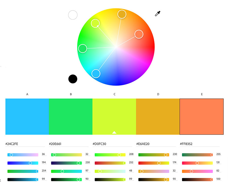
One of the best resources on color is Adobe Color. You can find a treasure trove of pallets already designed for you, or take a color you like and generate a whole new color pallet based on several different criteria like, contrast, monocolor, and complimentary.
ASSIGNMENT ONE:
Develop a design strategy for your photography business or for your new one-person business.
Color pallet.
Design aesthetic.
Try different color pallets, and figure out what you want to have your brand say about you.
What do you want your clients to think about when they think of your brand?
That is brand, of course.
ASSIGNMENT TWO:
Visit this addendum site for this class:
Minimal Viable Brand for Photographers Use this Password: CreativeClass
This is a class for those of you who need to make sure you have what you need as you begin your journey.
These are the tools you need.
From direct mail pieces to an email template, the list is complete.

