LET’S TALK TYPOGRAPHY
CREATIVE CLASS SIXTEEN

TYPOGRAPHY AND FONTS: THIS WILL BE FUN!

PROJECT ONE: A MAGAZINE FOR YOUR PHOTOGRAPHY
(Before we begin, note that there is an additional page for this module.
You will find the link on the right side of the page at the top.)
__________________
Typography Basics
Typography is the art and technique of arranging type to make written language legible, readable, and appealing when displayed. It can elevate the visual appeal of a design, clarify messaging, and influence the way information is perceived. Let’s delve deep into the world of typography.
1. Typographic Terms
- Baseline: The invisible line on which letters and characters sit.
- Cap Height: The height from the baseline to the top of capital letters.
- X-height: The height of lowercase letters, excluding ascenders and descenders.
- Ascender: The part of a lowercase letter that extends above the x-height, such as in letters ‘b’ and ‘d’.
- Descender: The portion of a letter that extends below the baseline, found in letters like ‘g’ and ‘p’.
- Kerning: The adjustment of space between individual letter pairs.
- Tracking: The uniform adjustment of spacing across a word or block of text.
- Leading (pronounced ‘ledding’): The space between lines of text.
- Serif: A small line or stroke regularly attached to the end of a larger stroke in a letter, like in Times New Roman.
- Sans Serif: Typefaces without the small line at the end of strokes, like Arial.
2. Font vs. Typeface
- Typeface: Refers to the design of letterforms, the way each character looks. It’s the creative work, the design itself. For example, “Helvetica” is a typeface.
- Font: Refers to the particular size, weight, and style of a typeface. If we compare this to music, think of the typeface as the song and the font as a specific recording of that song. Thus, “Helvetica Bold at 12pt” would be a font.
3. Most Popular Fonts in the World (English Only)
- Helvetica: Universally known for its clean, neutral look. Widely used in branding and design.
- Times New Roman: A classic serif font often chosen for long text and formal documents.
- Arial: A versatile sans-serif often used in both print and digital mediums.
- Georgia: A modern serif font known for its legibility on screens.
- Futura: Celebrated for its geometric design, it has a modernist feel.
- Garamond: A graceful and historic serif typeface, popular for centuries.
4. Modifying Type
- Scale: Refers to the size of your type. Adjusting the scale can help establish hierarchy.
- Weight: Refers to the thickness of the characters. Fonts often come in various weights, from ultra-light to black.
- Style: Encompasses italic, bold, underlined, etc.
- Color: Adjusting the color can create emphasis, represent brand colors, or convey mood.
5. Thinking About Using Type
- Purpose: Determine what the primary goal of your text is. Is it a headline, body text, or a call to action?
- Readability: Make sure your text is legible. This involves considering font size, leading, tracking, and kerning.
- Hierarchy: Use different type sizes, weights, and styles to establish an order of importance.
- Mood and Brand: The font you choose conveys mood. A playful font won’t work for a serious business report, and a rigid, formal font might not be right for a children’s birthday invite.
- Limit Font Use: Don’t use too many fonts in a single design. A good rule is to stick to 2-3.
- Contrast: Ensure there’s enough contrast between the text and its background. This ensures legibility and can also create emphasis.
To wrap up, understanding typography is essential for any designer. It’s not just about choosing a font; it’s about conveying the right message in the most effective and aesthetically pleasing manner. Like any art, mastering typography takes time, practice, and continuous learning.
MODULE SIXTEEN
page two not ready yet
SOFTWARE:
Photoshop
GIMP
Affinity Photo
Pixelmator
InDesign
Affinity Publisher
Scribus
Adobe Illustrator
Affinity Designer
Premiere
Premiere Express
Canva
Adobe Express
CapCut
Adobe Firefly
Chat GPT
AudioPen
Hypefury
Typeshare
Figma
Milanote
----
Our Facebook Page for sharing work and meeting peers. All are welcome.
TYPOGRAPHY ASSIGNMENTS:
Create a document that shows your creative process.
Use the hierarchy of typography in the use of headings, subheadings, and body copy.
Try setting the text several ways and work out the way that you love the look of.
Use the selection to the left, but if you do not have the typeface you want, use this link.
For instance, I typed in “Fonts that most resemble eras” and got this back.
The document should be a 4-page publication, a presentation, or a poster.
WHERE TO GET TYPE AND FONTS
Here are some websites that offer free fonts:
-
One of the oldest and best sources for downloading fonts, Dafont has over 77,000 fonts.
— -
This site is a great resource for fonts that are free for commercial use.
… -
This site offers a lot of free fonts that are open source and can be used for personal or commercial use.
… -
This site has over 16,000 fonts that can be used for commercial use.
… -
This site has a large collection of free fonts, many of which are free for commercial use.
Typography in Design: A Thoughtful Approach
Typography in Design: A Thoughtful Approach
Don’t think of typography as simply choosing a font and setting it. It’s a nuanced art that intersects design, linguistics, and psychology. When initiating a design project, considering typography with a strategic lens can amplify your message, guide your viewer’s journey, and elevate the overall aesthetic. Here’s what you should be pondering typographically:
- Purpose and Message: What’s the core message of your design? Understand the essence of your content and select a typeface that complements and accentuates that essence. For instance, a document emphasizing tradition and reliability may lean towards a classic serif, while a cutting-edge tech startup might prefer a sleek, modern sans-serif.
- Audience: Whom are you speaking to? Different demographics resonate with different typographic styles. Consider age, cultural background, and even industry-specific norms.
- Hierarchy: What do you want your viewer to notice first? Establish a clear hierarchy using type size, weight, and spacing. Headlines, sub-headlines, and body text should be distinguishable at a glance.
- Readability & Legibility: Ensure your text is easy to read, both in terms of the typeface chosen and the way it’s laid out. This means considering factors like kerning, leading, and tracking. Also, evaluate the color contrast between text and background.
- Medium: Are you designing for print, web, mobile, or a billboard? The medium can influence your typographic choices. For instance, some fonts that look great in print might not render as crisply on screens.
- Mood and Tone: Typography can elicit feelings and set the mood. Reflect on the emotion you aim to evoke—be it elegance, playfulness, gravitas, or simplicity—and let that guide your typographic decisions.
- Consistency: Maintain a consistent typographic theme throughout your piece. This doesn’t mean you can’t use multiple fonts, but they should complement each other and be used consistently for specific purposes (e.g., one for headers, another for body text).
- Constraints: Sometimes, brand guidelines or other restrictions might dictate certain typographic choices. Be aware of these from the outset.
- Cultural Nuances: Typography isn’t universally interpreted. For instance, in some cultures, certain fonts or styles might have specific connotations. It’s essential to be culturally sensitive and informed.
- Spacing and Layout: How you space your text—line length, paragraph spacing, margins—can vastly impact readability and aesthetic appeal. Ensure your layout allows your typography to breathe and guide the viewer’s eye naturally through the content.
- Experiment and Iterate: Finally, don’t be afraid to try different typographic treatments. Test your designs on a range of people, gather feedback, and iterate. Sometimes, a slight tweak can transform a design from good to outstanding.
Typography is much more than text on a page or screen. It’s a powerful tool that, when wielded with thought and intention, can turn your design into a compelling narrative, ensuring your message isn’t just seen—but felt and remembered.
The Essential 8: Fonts Every Designer Should Know and Utilize
Typography forms the foundation of design, and choosing the right font can make or break a project. While there are thousands of fonts available, a few have withstood the test of time and have become staples in the design community. Here are the essential eight fonts that every designer should be familiar with:
- Helvetica: This Swiss-designed sans-serif is the epitome of neutrality and clarity. From corporate logos to subway signs, its versatility has made it a favorite since its introduction in 1957. There’s a reason why it’s often joked that designers use Helvetica for everything—it just works.
- Times New Roman: Rooted in tradition, Times New Roman is a serif font often associated with newspapers, books, and academic papers. Its familiarity and readability make it a reliable choice for extensive textual content.
- Futura: With its geometric shapes and modernist charm, Futura captures the essence of forward-thinking and modern design. From logos to headlines, it’s a font that always feels fresh.
- Garamond: Named after the 16th-century French punch-cutter Claude Garamond, this elegant serif font is often chosen for its timeless beauty and readability. It’s a favorite for books and other long-form content.
- Gill Sans: A humanist sans-serif, Gill Sans merges the clarity of sans-serif designs with some classical structural characteristics typical of serif typefaces. Its balance between modernity and tradition has made it a mainstay in the design world.
- Baskerville: A transitional serif typeface, Baskerville stands out with its refined structure and high contrast. Its unique design ensures that it remains both legible and elegant—a combination that has been appreciated in both print and digital formats.
- Bodoni: With its dramatic contrast between thick and thin strokes, Bodoni is a modern serif typeface that brings a touch of sophistication and luxury. It’s a popular choice for fashion magazines and upscale branding.
- Akzidenz-Grotesk: Predating Helvetica, Akzidenz-Grotesk is a sans-serif typeface that has influenced a multitude of modern fonts. It boasts a straightforward, objective design, making it a favorite for both print and digital mediums.
- Caslon: Stepping back into the 18th century, we find Caslon, a serif typeface named after its creator, William Caslon. A typographic gem of its time, Caslon boasts an organic, warm feel, making texts appear approachable and readable
For designers, these eight fonts act as a foundational toolkit, offering a blend of versatility, tradition, and modernity. But remember, while these are staples, always keep an eye out for emerging fonts and typefaces. The design world is continuously evolving, and staying updated ensures your work remains fresh and relevant.
For those looking to craft designs with a touch of history, elegance, and readability, these fonts offer a veritable treasure trove of possibilities. Embrace their unique characteristics.
With these nine typefaces, I feel I could design anything, anywhere.
I encourage you to experiment with your own typographic choices but know that you can’t hardly go wrong with the fonts listed here.

Mastering the Art of Font Pairings
Typography isn’t just about choosing a single, impactful font—it’s also about understanding how fonts interact and harmonize when paired. Font pairing is the art of combining two or more fonts in a design to create contrast, harmony, and hierarchy. When done right, font pairings can guide the reader’s eye, establish mood, and ensure legibility. However, not all fonts play well together, so it’s essential to understand the principles of effective font combinations.
Why is Font Pairing Important?
- Hierarchy: Using different fonts can help establish an order of importance in your design, guiding the reader’s eye from the most crucial information to secondary details.
- Contrast: Combining fonts with distinct characteristics—like a bold sans-serif title with a delicate serif body—can make your design pop.
- Cohesiveness: When fonts complement each other, they can evoke a specific mood or theme, giving your design a unified feel.
Five Classic Font Pairings:
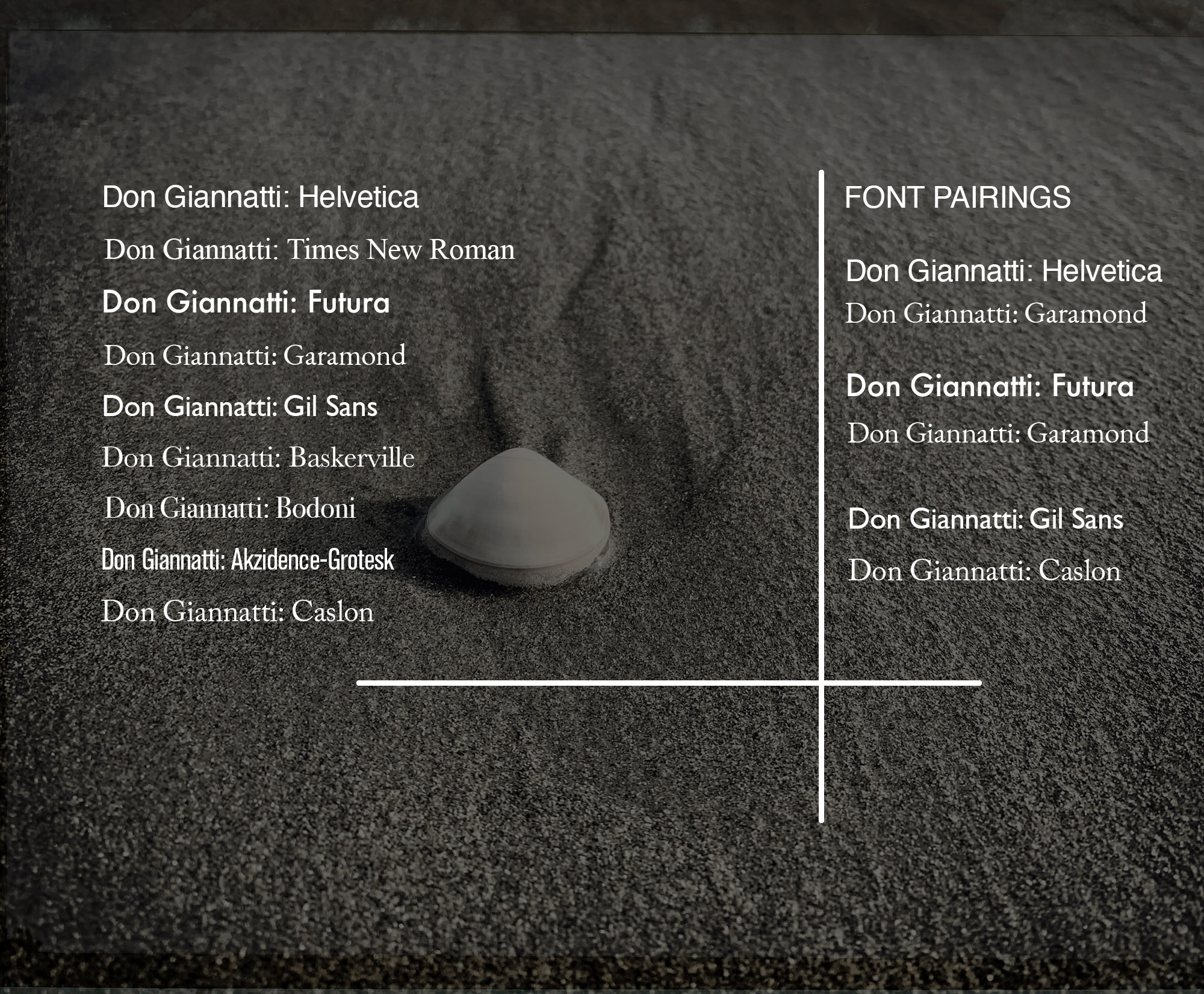
- Helvetica & Garamond: The simplicity and neutrality of Helvetica contrast beautifully with the timeless elegance of Garamond, creating a versatile combination suitable for both print and digital.
- Futura & Baskerville: Futura’s modern, geometric forms paired with the refined, transitional serifs of Baskerville offer a blend of modernity and tradition that’s especially effective for brands seeking a contemporary yet sophisticated feel.
- Gill Sans & Caslon: Gill Sans, with its humanist charm, provides a clean backdrop for the historic and organic features of Caslon. This pairing melds the linearity of modern design with classical undertones.
- Arial & Times New Roman: Both these fonts are staples in the design and publishing industries. Arial’s straightforward sans-serif qualities offer a clear juxtaposition against the classic serifs of Times New Roman, ensuring readability and balance.
- Raleway & Roboto Slab: The high-end, sans-serif design of Raleway complements the tech-friendly and approachable feel of Roboto Slab. This pairing feels both modern and inviting, perfect for digital interfaces and tech branding.
When curating font pairs for your design projects, it’s crucial to test and iterate. What works for one project might not be suitable for another. However, understanding the principles of pairing and drawing inspiration from classic combinations will give you a strong foundation to build upon. So, let the dance of fonts begin, and watch as they harmonize to elevate your designs to new heights.
Unraveling Display Fonts: Impact and Implementation
In the vast universe of typography, display fonts emerge as the show-stoppers. These are the typefaces that command attention, evoke emotion, and set the mood at first glance. But what exactly are display fonts, and how should one harness their full potential? Let’s delve in.
What are Display Fonts?
Display fonts, as the name suggests, are specifically designed for use at large sizes, ensuring they grab the viewer’s attention. They are often the “loudspeakers” of the typography world: bold, expressive, and full of character. While traditional fonts aim for legibility and neutrality, display fonts venture into the realms of creativity and uniqueness.
Key Features of Display Fonts:
- Distinctiveness: Display fonts often have unique characteristics that make them stand out, be it intricate details, unconventional shapes, or whimsical elements.
- Limited Text: Given their decorative nature, display fonts are best suited for short bursts of text like headlines, logos, or posters. They aren’t designed for extended paragraphs or body text.
- Mood Setters: Their distinct styles can instantly set the tone for your design—be it vintage, futuristic, playful, or dramatic.
Guidelines for Using Display Fonts:
- Less is More: Given their impactful nature, it’s often best to use display fonts sparingly. Overdoing it can make your design feel cluttered and reduce readability.
- Pair Wisely: When complementing a display font with another typeface, opt for something more neutral and understated. For instance, a bold display font for the headline can be paired with a simple sans-serif for the body text.
- Mind the Size: Display fonts are designed for larger scales. If used too small, you might lose intricate details, and legibility can drop.
- Understand the Mood: Ensure the display font you choose aligns with the mood and message of your content. A quirky font might not suit a serious corporate announcement, just as a stately and ornate font might feel out of place on a children’s party invitation.
- Test Extensively: Display fonts can vary vastly in terms of design and readability. Always preview them in your intended context to ensure they work well both aesthetically and functionally.
In the hands of a discerning designer, display fonts are like the spices in a culinary masterpiece—they can elevate a design and make it unforgettable. However, as with all powerful tools, they demand respect and thoughtful application.
By understanding their strengths and potential pitfalls, designers can harness display fonts to craft designs that not only captivate but also communicate effectively.
Stay Focused: Build Deliberately
The Creative Class
Expanding your toolkit.
Make more money.
Create a stable business.
Live a great life.
Eat tacos.
