PHOTOGRAPHY AND DESIGN PROJECTS
CREATIVE CLASS THIRTEEN
PHOTOGRAPHY AND DESIGN PROJECTS
PROJECT ONE: A MAGAZINE FOR YOUR PHOTOGRAPHY
(Before we begin, note that there is an additional page for this module.
You will find the link on the right side of the page at the top.)
__________________
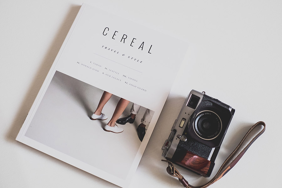
Details: 24-page self-promotion magazine directed to your client base.
You’re a photographer.
Your pictures are worth a thousand words.
But wouldn’t it be something if you could also present them in a tangible, curated format?
Enter the personal magazine.
A 24-page voyage into your craft.
No software talk here, folks, just pure ideation.
Grab a cold one, and let’s get going.
1. Define Your Purpose:
First and foremost, why do you want this magazine? Is it a portfolio? A showcase of a specific project? A behind-the-scenes peek at your process? Nail down your ‘why’. Every page, every image, every word should loop back to this purpose.
2. Storyboarding: The Blueprint
Break your magazine down: Think of it as six 4-page segments. Now, considering your purpose, plan what each segment will represent. You might want to start with an introduction, then lead into various themes or genres of your photography. Or perhaps you’d prefer a chronological journey. Your storyboard, your rules.
3. Image Selection: The Heart of Your Magazine
Out of thousands, how do you choose? It’s like picking a favorite child, right? But remember, this isn’t just about showcasing your best shots, but the right shots. Think cohesion, narrative, and impact. And, hey, don’t overcrowd. Give your images space to breathe and be absorbed.
4. Words Matter Too:
Even if you’re letting your images do most of the talking, captions, anecdotes, or reflections can enhance the viewer’s experience. Add a dash of your personality, some behind-the-lens stories, or technical notes. It’s a touch of ‘you’ on paper.
5. A Grand Introduction:
Your opening spread should be a showstopper. It’s the ‘handshake’ of your magazine. A striking image, paired with a personal note, can set the tone. Remember, first impressions are everything!
6. Consistency is Key:
While every segment of your magazine can have its own flavor, there should be a consistent undertone. Whether it’s in the layout, the type of images, or the color scheme, let there be a thread that ties it all together.
7. Personal Touches:
Maybe it’s a page dedicated to your studio space, your favorite camera gear, or even snippets from your photography journal. Let your readers (or clients) in on the person behind the lens.
8. End with a Bang!
Your final pages should be just as memorable as your first. Think of it as the encore of a great concert. Leave your viewer wanting more, itching to pick up the phone and dial you for their next gig or project.
9. Test It Out:
Once you’ve put together your draft, get some feedback. Not just from peers, but from folks outside the industry. Fresh eyes can give invaluable insights.
10.Quality Over Quantity:
This isn’t about filling 24 pages, but making every page count. It’s about showcasing you and your work in the best light (pun intended).
There you have it.
Your roadmap to creating a 24-page promotional piece that does more than just showcase photos—it tells your story. A tangible magazine can leave a lasting impression.
So, go on, put yourself out there, and let the world see the world your amazing work.
The Art of Culling: Navigating Your Way to the Perfect 24 Images
Editing can be a joy or one of the most painful adventures you can go on!
Okay, so you’ve got hundreds, if not thousands, of images in front of you, and the daunting task of narrowing them down to the top-tier 24 for your magazine. (My favorites are in maroon.)
1. Digital Thumbnails:
Before you get all fancy, start simple. Most software lets you view your images as thumbnails. Get them all on screen and start with a rapid-fire gut reaction cull. Trust me, your gut knows what it’s doing.
2. The ‘Two-Day Rule’:
This one’s a favorite. Pick your potential best shots today. Then, revisit them in two days. You’ll be amazed at how your perspective changes after giving yourself a little breather. Fresh eyes can be your best ally.
3. Create a Rating System:
You can use color codes, star ratings, or flags. The idea is to group your images into categories like ‘Definitely’, ‘Maybe’, and ‘Not this time’. Filter them, review, and narrow down until you hit that magic number.
4. Projector Showcase:
If you’ve got a projector, use it! Project your images on a blank wall. This allows you to step back, quite literally, and see your work in a larger-than-life format. There’s something about seeing your image big that makes the standout ones… well, stand out!
5. Mood Board Magic:
Create a mood board with a specific theme or feel you’re going for in your magazine. As you look at your images, ask yourself which ones vibe with your mood board. It’s like matchmaking for pictures.
6. Get a Second (or Third) Opinion:
Invite over a trusted colleague, or even a friend who simply appreciates art. Sometimes, having another set of eyes can offer fresh insights, catch things you missed, or reaffirm your choices.
7. The Story Test:
Remember, your magazine tells a story. Lay out potential images and ask yourself, does this flow? Is there a narrative arc? Sometimes even a great shot may not fit the storyline. Be ruthless!
8. The Emotional Impact:
This isn’t just about technical perfection. Which images evoke emotion? Which ones make the heart beat a bit faster? Those are your keepers.
9. Physical Layout Play:
Go old-school. Print the images and play with them on your living room floor, or pin them up on a corkboard. Physically moving photos around can help you visualize the flow way better than digital methods.
10. Limit Your Choices Initially:
Instead of sifting through thousands, pick out, say, 50 that you feel strongly about. Then, cull from that smaller batch. It’s less overwhelming and helps you focus on quality right from the get-go.
There you have it! Dive into this culling adventure with confidence. Remember, every image you choose should resonate with you and serve the narrative of your magazine. So, roll up those sleeves and embark on this delightful journey of selection. Cheers to crafting the perfect 24!
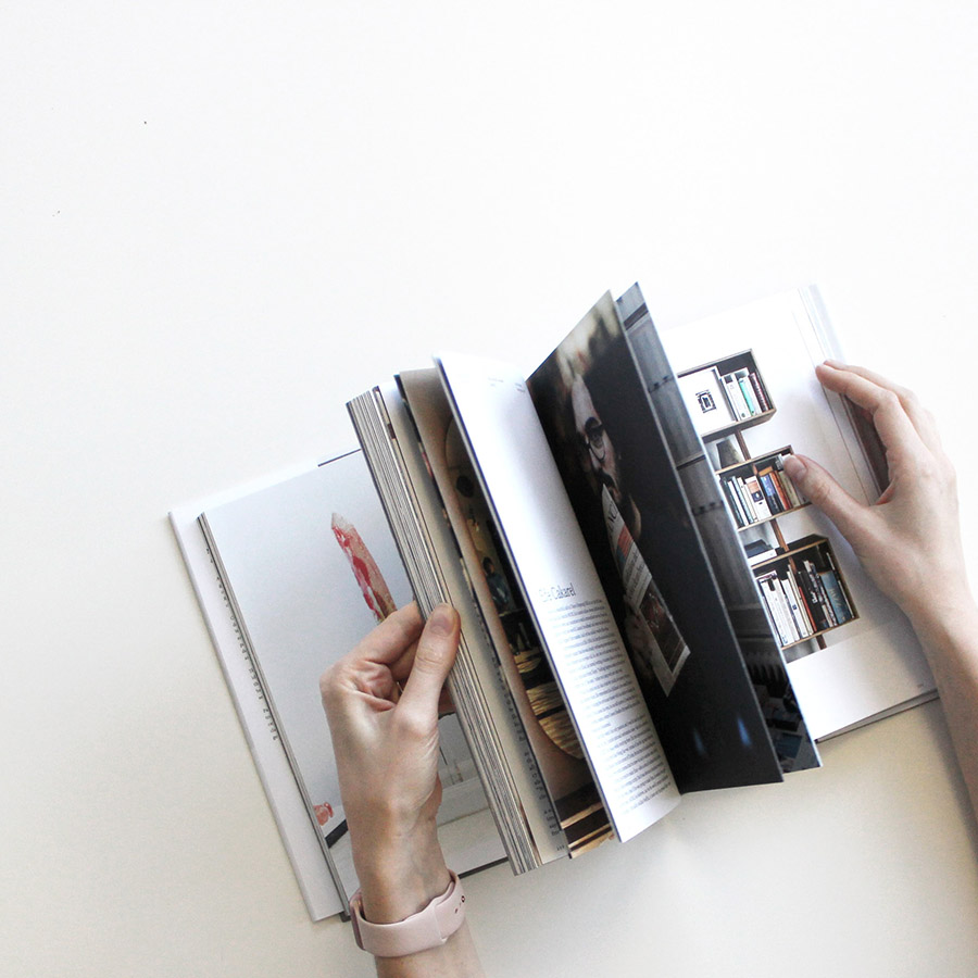
From a Folder of Photos to Printed Masterpiece:
Turning Your 24 Images into a Polished Magazine
The final steps
First off, kudos to you for navigating the challenging waters of culling and coming out with 24 gems!
The tough part is over.
Now, let’s get these photos off your hard drive and onto some lustrous pages where they belong.
Buckle up!
1. Determine Your Magazine’s Narrative:
You’ve got your images, but what’s the story they’re telling? Start by arranging them in a sequence that tells a coherent, compelling narrative. It’s not just about placing pretty pictures together; it’s about weaving a visual tale.
2. Choose Your Format:
Before you jump into design, consider the size and orientation of your magazine. Are you going for a traditional 8.5×11-inch? Maybe a square format? Your images might lend themselves better to one layout over another.
3. Design Layout and Flow:
While we’re not diving deep into software specifics, it’s essential to know that many photography-focused platforms can assist with layout. Programs like Adobe InDesign or even simpler tools like Canva have magazine templates. Lay out your images, considering the balance between single-image pages and spreads.
4. Leave Room for Text:
Whether it’s a brief introduction, captions, or extended reflections on certain images, text can enhance your magazine’s depth. Just ensure your words complement, not overshadow, the visuals.
5. Quality Matters: Paper and Print:
Your images deserve the best! Research printing options, considering factors like paper weight, gloss vs. matte finishes, and binding methods. Some companies specialize in magazine or photobook printing, offering high-quality results tailored to photographers.
6. Proof, Proof, and Proof Again:
Before hitting that final print button, get a proof copy. This step lets you check the colors, quality, and overall feel. Sometimes, colors that look great on screen might not translate as well in print. Adjust as necessary.
7. Seek Feedback (Again!):
Yes, you did this during the culling process, but it’s just as valuable now. Share your draft with trusted peers or mentors. Fresh eyes might spot things you missed.
8. Final Touches and Flourishes:
Considering a special touch? Maybe a unique cover material, embossing, or even a limited edition print number on each copy? These details can elevate your magazine from ‘great’ to ‘exceptional.’
9. Choose Your Printer:
Once satisfied, it’s time to select a printer. There’s a range out there, from local boutique printers to larger online platforms. Research, read reviews, ask for samples, and choose one that aligns with your vision (and budget!).
10. Distribution & Promotion:
Once you’ve got your printed masterpiece in hand, think about how you want to share it. Hand them out at meetings with potential clients, send them to galleries, or even sell them as limited editions. Remember, this magazine is not just a collection of images; it’s a testament to your journey and craft.
And voilà! From a myriad of digital images to a curated set of 24, and now, a tangible magazine that speaks volumes about your artistry. Relish in this achievement and let it be a stepping stone to many more creative endeavors.
So, what are you waiting for?
Your magazine’s audience awaits.
MODULE ELEVEN
page two not ready yet
SOFTWARE:
Photoshop
GIMP
Affinity Photo
Pixelmator
InDesign
Affinity Publisher
Scribus
Adobe Illustrator
Affinity Designer
Premiere
Premiere Express
Canva
Adobe Express
CapCut
Adobe Firefly
Chat GPT
AudioPen
Hypefury
Typeshare
Figma
Milanote
----
Our Facebook Page for sharing work and meeting peers. All are welcome.
BUSINESS ASSIGNMENTS:
Let’s dive into some hands-on assignments that’ll stretch your creativity, merge your skills, and catapult you into the vibrant world of graphic design for business
WHERE TO GET ASSETS
KITTL: for image and graphic assets.
Fifty Free assets for Graphic Designers
Free Design Resources for Designers
41 Free Resources for Graphic Designers
Nailing Your Magazine Design:
Creating a Seamless Flow from Page to Page
Hello, workshoppers!
So, you’re diving deep into the design aspect of your magazine. A thrilling adventure, isn’t it? Let’s demystify some of the core design decisions that can make your magazine go from ‘good’ to ‘WOW’!
1. Single Image Per Spread vs. Dual Images:
- Single Image Per Spread:
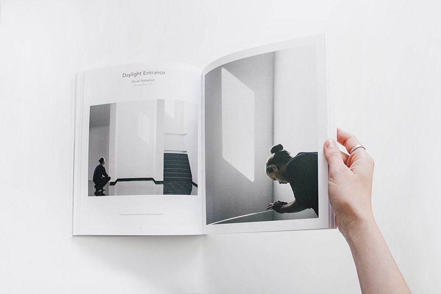
- Pros: A single image per spread (one image spanning two pages) offers a grand, immersive experience. It creates a dramatic impact, letting the viewer fully engage with each shot, taking in all its nuances.
- Cons: You’re essentially dedicating two pages to a single moment. It’s a bold choice and means you’re confident that each image can hold its weight.
- One Image on Each Side of the Spread:
- Pros: This allows you to showcase more images or to pair complementary photos together, perhaps contrasting or telling a two-part story. It’s excellent for images that speak to each other or play off one another.
- Cons: Without careful consideration, it can feel cluttered or mismatched. The balance between the two images is crucial, so they don’t overshadow each other.
2. White Background vs. Black Background:
- White Background:
- Pros: A white backdrop gives a clean, airy feel. It makes colors pop and offers a modern, minimalistic look. Especially effective for vibrant or daytime shots.
- Cons: If not paired with the right images, it can sometimes feel stark or plain.
- Black Background:
- Pros: It brings drama! A black background can heighten contrast and make colors more intense. It’s fantastic for moody, atmospheric, or monochrome shots.
- Cons: Can feel heavy if overused, and might overshadow lighter or subtle images.
3. Font Pairings:
The fascinating world of typography—a place where tiny tweaks can transform the entire aesthetic of your magazine.
- Contrasting Serif and Sans Serif: Combining a timeless serif font (think fonts with little feet, like Times New Roman) for headings, with a clean sans-serif (those without feet, like Arial) for body text, can create a sophisticated look.
- Play with Weights: Using different weights (bold, regular, light) of the same font can offer variety while maintaining cohesion.
- Limit Your Choices: Stick to 2-3 fonts to keep things consistent and avoid a messy appearance. The old adage “less is more” couldn’t be more apt.
- Readability is Key: While that fancy script font might look exquisite, ensure that whatever you choose is legible, especially for longer text.
Every choice should be intentional.
Portfolio Magazine vs. Photographer’s Monograph:
Navigating the Fine Print
You should put some thought toward whether you want to make a portfolio magazine or a monograph.
Two important differences.
1. Portfolio Magazine:
A portfolio magazine is primarily designed as a sampler or a showcase of a photographer’s breadth of work. Think of it as your visual résumé!
-
Purpose: It’s meant to present a variety of your best works, often aimed at potential clients or employers. It showcases your versatility and style.
-
Content: Contains a wide range of images, possibly from different shoots, themes, or subjects. It’s your “greatest hits” album.
-
Audience: Generally aimed at potential clients, agencies, galleries, or anyone you want to pitch your skills to.
2. Photographer’s Monograph:
A monograph, on the other hand, is a comprehensive presentation of a singular subject, theme, or project by the photographer.
-
Purpose: It’s more about telling a detailed, cohesive story or exploring a specific concept in depth. It’s personal, reflective, and often more artistic.
-
Content: The images in a monograph revolve around a singular theme, subject, or narrative. It’s like a concept album in the music world.
-
Audience: Generally aimed at photography enthusiasts, fellow photographers, critics, or anyone with a keen interest in the specific subject or theme you’re exploring.
Which One’s For Me? Here’s What to Consider:
-
Objective: If you’re looking to attract clients or job opportunities, a portfolio magazine is your best bet. But, if you’re aiming to present a deep, artistic study or narrative, lean towards a monograph.
-
Budget: Monographs, given their in-depth nature, can sometimes be pricier to produce (especially if you’re considering high-quality printing or special materials).
-
Time & Effort: Preparing a monograph often demands more time and introspection. It’s not just about showcasing great shots, but about weaving a coherent, compelling narrative.
-
Feedback: Before deciding, share your work with trusted peers. Sometimes, an external perspective can help clarify whether your images are better suited for a broad showcase or an in-depth exploration.
Both formats have their merits, and the best choice largely depends on your intention, content, and audience.
Harnessing the Grid:
A Game-Changer in Layout Design for Photographers
Well, weve ventured into the intricate world of layout design.
Exciting, right?
And if there’s one tool you’ll come to cherish, one secret weapon that every seasoned designer swears by, it’s the grid. Let’s decode this unsung hero of the design realm, shall we?
Why Bother with the Grid?
Imagine cooking up a 4 course dinner without a recipe, or building a house without blueprints. You might end up with unexpected results or a structure that’s… well, not quite right. The grid in design serves a similar foundational role as a recipe or blueprint—it’s a guiding framework that brings structure, balance, and harmony to your pages.
The Perks of the Grid:
- Consistency & Cohesion: A grid ensures uniformity across pages. This creates a predictable rhythm that makes your work look professional and easy to digest.
- Visual Hierarchy: A well-structured grid can guide the viewer’s eye, highlighting key elements and ensuring your message is loud and clear.
- Flexibility: While grids offer structure, they’re not rigid. They’re adaptable, allowing for creativity within boundaries, and ensuring your design doesn’t descend into chaos.
Using the Grid to Your Advantage:
- Selecting Images: Grids can guide your image choice. Have a slot for a landscape image in your grid but only portrait shots left? It helps you understand what you need.
- Pairing and Grouping: With grids, you can easily visualize pairs or groups of images that work well together. Some cells can host a single, standout shot, while others can showcase a series of related images.
- Spacing & Margins: The consistent spaces (gutters) between grid cells ensure your content doesn’t feel squashed. It provides breathing room, making the content easily accessible and enjoyable.
- Breaking the Grid: Once you’re familiar with working within the grid, you can strategically break away from it. A bold image bleeding off the edge or an asymmetrical layout can create dramatic focal points.
Tips for Grid Mastery:
- Start Simple: Begin with a basic grid—say, a 3×3 or 4×4. Get a feel for it. As you grow confident, you can play with more complex structures.
- Test & Iterate: Lay your images out, flip through the pages, and adjust. Maybe that triptych works better on the top row, or perhaps that portrait shot needs a cell all to itself.
- Remember the Gutter: That space between cells? It’s not wasted. It’s crucial negative space that lets each image breathe.
In essence, the grid is a bit like the unsung rhythm guitarist in a rock band. It might not always be front and center, but it provides the consistent rhythm and structure that holds everything together. So, photographer, as you set forth on your design journey, embrace the grid, experiment with it, and let it elevate your work from good to breathtaking.
